
Unless is currently developing a series of algorithms to predict the behavior of new, anonymous website visitors. The goal is to make websites scan and classify these visitors, so they can be served an individualized experience that fits their state of mind.
In the first part of the series we were training a machine learning model to differentiate between visitors with a low attention span and high one. Now, data scientist Boyan Angelov will dive deeper into the contributing factors behind this.
Explainable AI
In order to uncover the driving factors in a model, we will use methods which broadly fall in the category of explainable machine learning (often abbreviated as xAI). This is a field which has been growing in popularity in recent years, partly driven by increasing complexity of "black box" models such as deep learning, and changes in regulations such as GDPR.
Often the increase in accuracy that we observe by using such advanced models is paid for by decreased understanding as to how exactly they operate and make certain decisions. This can prove to be very important in cases where machine learning models carry high risks, such as the decision-making behind self-driving cars and health status predictions.
Source: http://nautil.us/issue/40/learning/is-artificial-intelligence-permanently-inscrutable
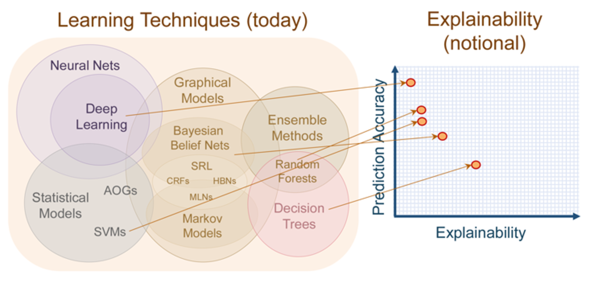
On this diagram you can observe that tree-based methods tend to be more interpretable than Deep Learning, and this is one of the major reasons we selected them. On top of that, they tend to be excellent when used with structured data.
In our research, we will be using those models and techniques for another purpose. They should help us understand the factors behind the attention span model we built in the previous post.
Feature importance
We start our analysis simple, by using a well-known and stable technique - feature importance. This is a standard method for understanding the inner workings of a tree-based machine learning model (in our case we used a Gradient Boosting model), which is the calculation of feature importance. Note: the mathematics behind the calculation of feature importance are well explained in this blog post.
Below, you can have a look at the feature importance plot.
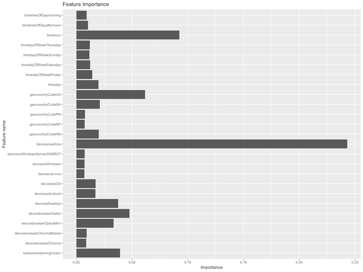
Here you can observe which are overall driving factors behind the attention span prediction. In our case, th emost important traits are the “deviceview.Size” and “timehour”. The names of those variables should be self-explanatory, but for the sake of clarity the former is the width of the display on which the content was viewed (in pixels), and the latter is the time of day (0-24) of the viewing event.
Partial Dependence Plots (PDP) are slightly more advanced than feature importance, and they are used to visualise the contribution of an individual feature to the prediction. This will help us dig deeper.
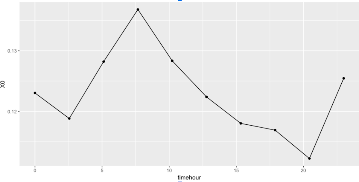
On this plot we observe one clear peak in attention span, and one obvious low. The peak occurs in the morning around 9:00, and the fall is in the evening between 18:00 and 20:30. There are many different possibilities for why this is the case, and further investigation is required.
- Perhaps, users tend to be very focused on reading blogs or a website early in the morning when they get to work?
- And late in the evening they might be less so, trying to consume as much content as possible without having the patience to concentrate on one at a time?
For investigating the similarities between the features we can use a PCA plot. This method is used in many applications in machine learning, often to reduce the dimensionality (number of features) in the data, and to discover patterns. The basic principle is that features that contribute to the variation in the data in a similar way have smaller angles between them. Let’s have a look:
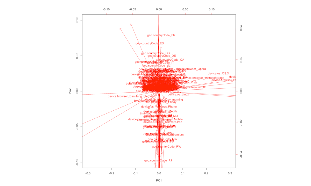
Parts of the plot might be difficult to read, but the large patterns are relatively clear. We can see that device browsers have similar effects (except for the Samsung browser - this outlier is very interesting for a future investigation), and two opposite effects of the “country” feature. Time-related features such as “timeday” have small angles between them, thus can serve as a sanity check that the patterns we see are indeed meaningful.
This is not the end
Sorry for the cliffhanger, but... The investigations described above are just the tip of the iceberg and there many additional features we are exploring, so stay tuned for future posts!